
Case study · Website, CMS and custom designer
Rebuilding Memorials of Elegance around the questions families actually ask.
The old website held years of useful information, but finding the right memorial or knowing what to do next took too much work. I redesigned the whole experience, built a structured catalogue and CMS, and created two guided tools for memorial design and renovation enquiries.
The brief
Memorials of Elegance is a family-run memorial masonry business in Swinton, Rotherham. It serves people who may be choosing a memorial for the first time, often while dealing with grief and unfamiliar cemetery rules. Those customers need plain information, patience and a clear way to ask for help. They do not need to be pushed through a sales funnel.
The previous website had grown over time. It contained service pages, product listings, guidance, obituaries, contact information and image galleries, but the structure did not give every part a clear purpose. Useful information sat inside long pages. Product discovery stopped at basic category grids. Contact routes asked people to start with a blank form even when they had already found a memorial they liked.
The brief was to replace that patchwork with one considered platform. The public website needed to explain the service, present more than 200 memorials, support sensitive decisions and turn interest into a useful conversation. Behind it, the business needed a content system shaped around memorial products rather than a generic page editor. The project also called for an interactive designer that could help a customer explore an inscription without placing an order online.
- Client
- Memorials of Elegance
- Scope
- Research, UX, website, CMS and custom tools
- Status
- Live
Starting with the old site
I captured the old website before the domain was redirected. That gave me a proper record of the experience on desktop and mobile, including the awkward parts that are easy to forget once a redesign is live.
The old site was not a disaster. It had done its job for years and contained a great deal of specialist knowledge. The problem was that the experience reflected how the content had accumulated, not how a customer thinks. The redesign kept the useful knowledge, removed dead ends and gave every page a clearer job.
1. A clearer first impression
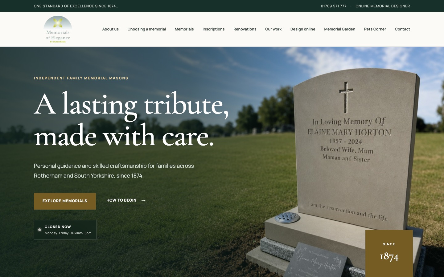
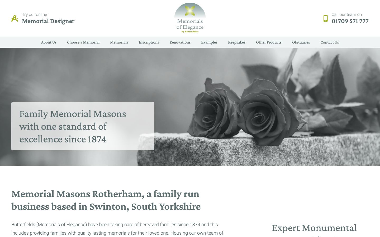
The old homepage opened with a general headline and a decorative rose image. It said what the business made, but it did not quickly explain the location, the family background or how a visitor should begin. The redesigned hero uses one direct proposition: “A lasting tribute, made with care.” Supporting copy names Rotherham and South Yorkshire, while the 1874 date establishes the history without forcing the visitor to hunt for it.
The two actions have different jobs. “Explore memorials” is for someone ready to browse. “How to begin” is for someone who needs guidance first. A live opening status and visible phone number answer practical questions before they become friction.
2. Mobile content in the right order
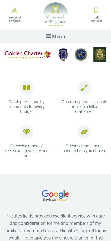
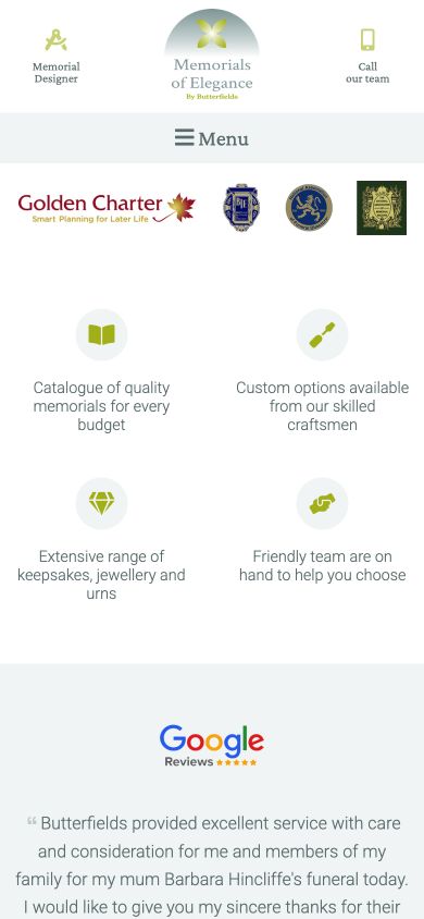
On the old mobile homepage, accreditation badges and review graphics appeared before the main page content. They were useful trust signals, but their position delayed the answer to a more basic question: what does this business do for me?
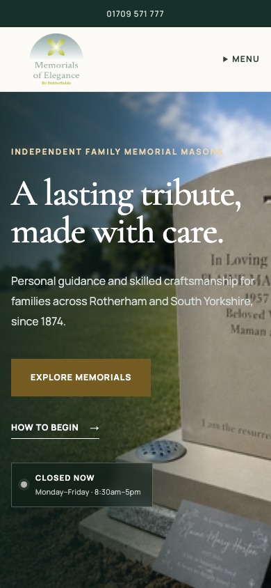
The new mobile layout starts with the service, the location and the next actions. Trust evidence still matters, but it now appears when the visitor has enough context to understand it. The navigation also became a compact anchored panel rather than a full-screen interruption. That keeps the page visible and makes it easier to close the menu without losing your place.
3. Guidance without the wall of text
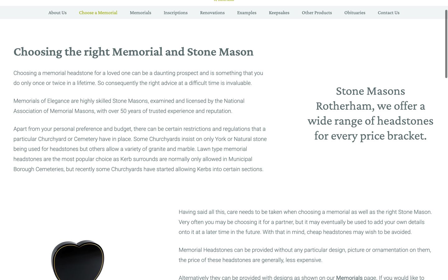
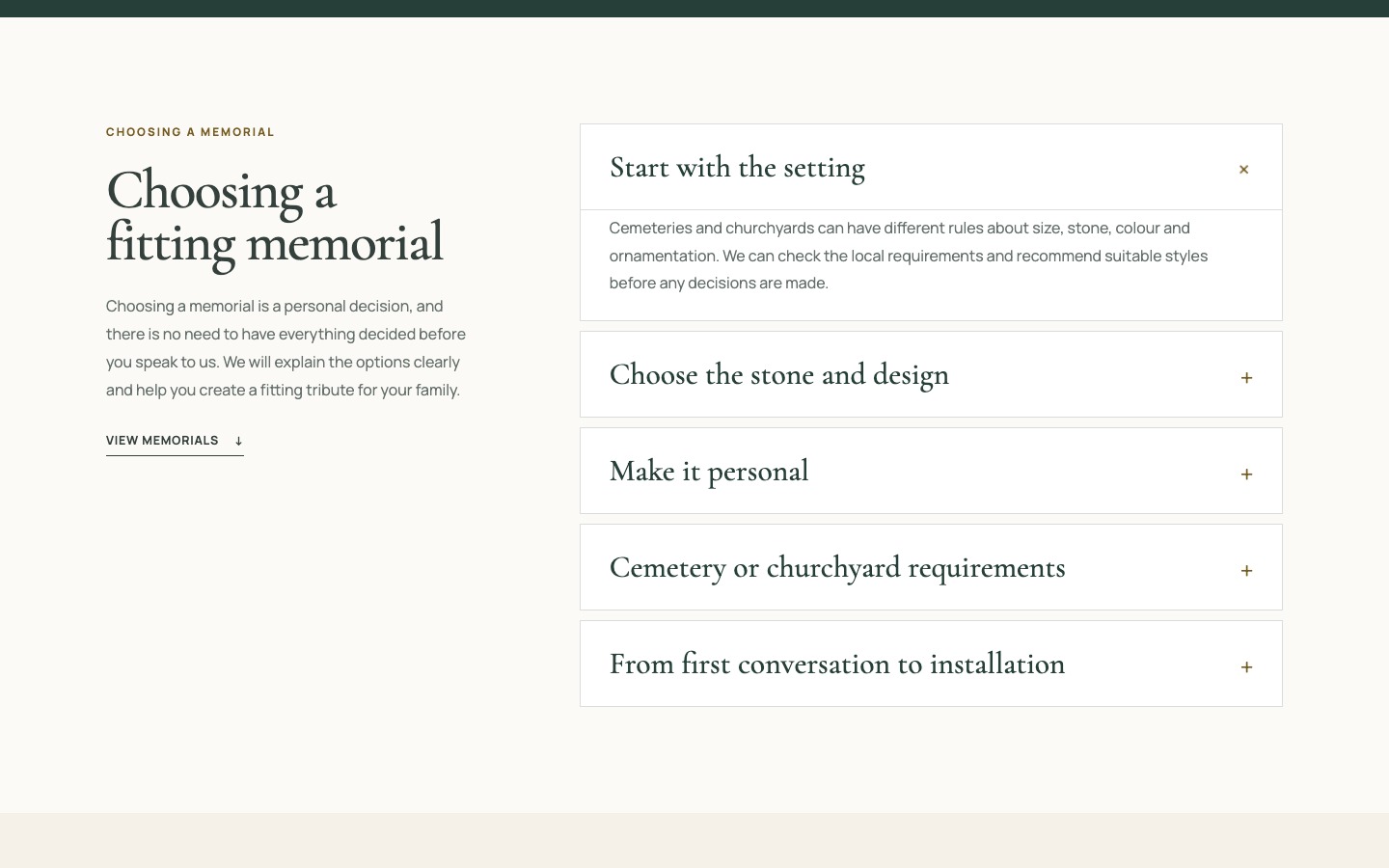
Choosing a memorial involves several decisions: the setting, stone, shape, inscription, cemetery rules and installation. The old guide tried to cover those subjects in one long page. The information was sound, but the presentation made it difficult to scan and easy to postpone reading.
I split the guidance into five expandable topics. The introduction reassures visitors that they do not need to have everything decided. Each accordion then answers one part of the process in ordinary language. This is not a case of simply cutting copy. It is the same specialist knowledge with a better reading order and more control for the visitor.
4. A catalogue people can search
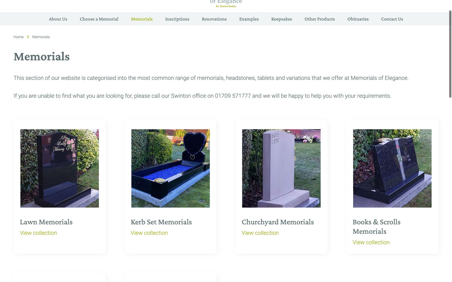
The previous catalogue offered broad category tiles, but there was no quick way to find a known memorial by name or narrow the collection by type. Elsewhere, the site relied on very long pagination controls. One archived page showed 329 numbered buttons. That was a symptom of content being stored without enough thought about retrieval.
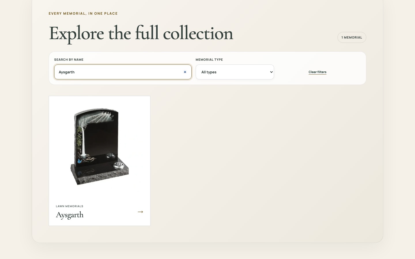
The new memorial collection contains 217 products at launch. Customers can still browse visually by style, but they can also search by name and filter by memorial type. Results update in place, the current count stays visible and “Clear filters” provides an obvious reset. Loading more products is progressive, so the visitor is never faced with a wall of page numbers.
The filtered Aysgarth state is a small screen with a large practical benefit. It shows the search term, confirms that one memorial matches, displays the result and offers a way back. That is the sort of detail that makes a catalogue feel dependable.
5. From a product to a useful enquiry
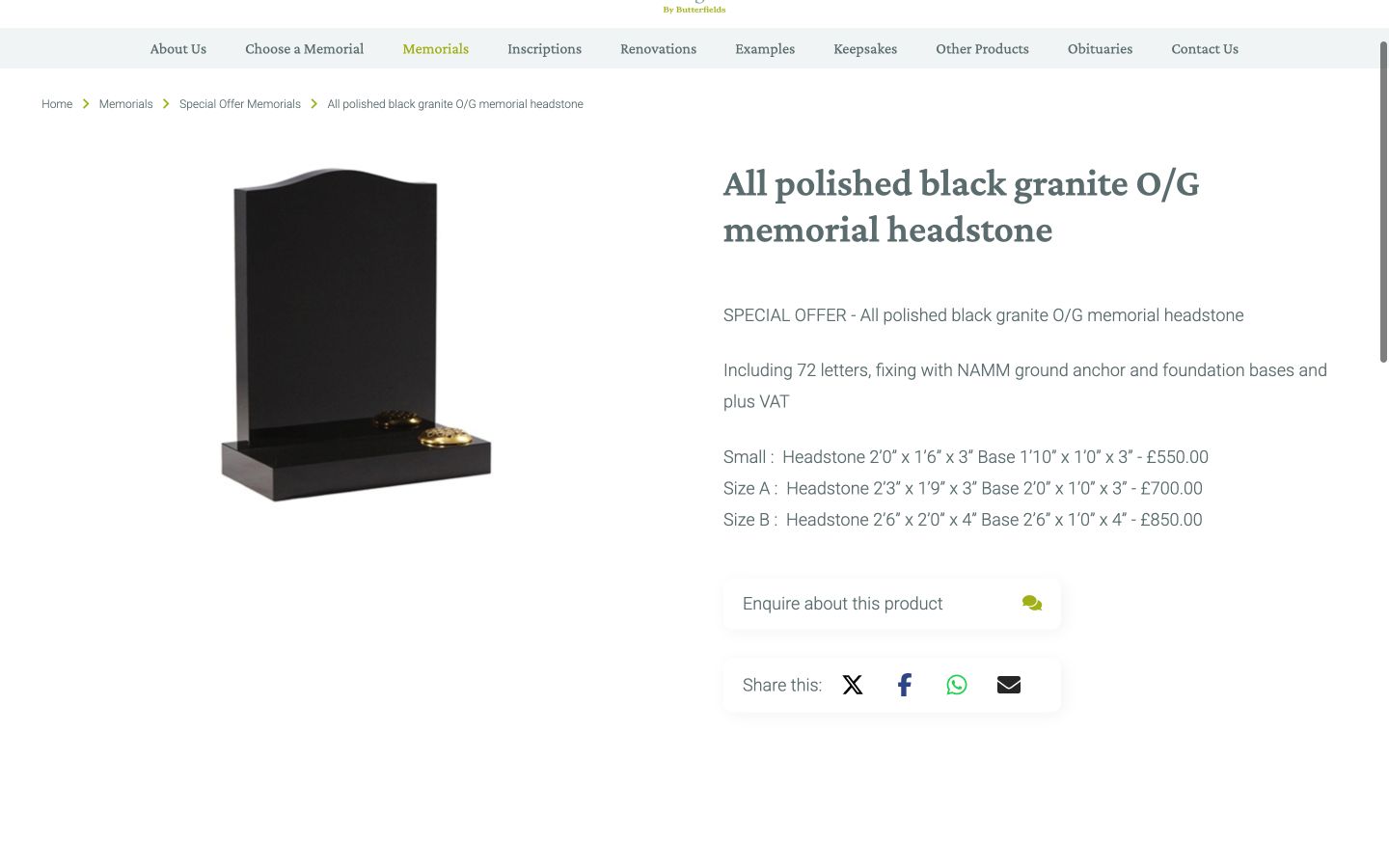
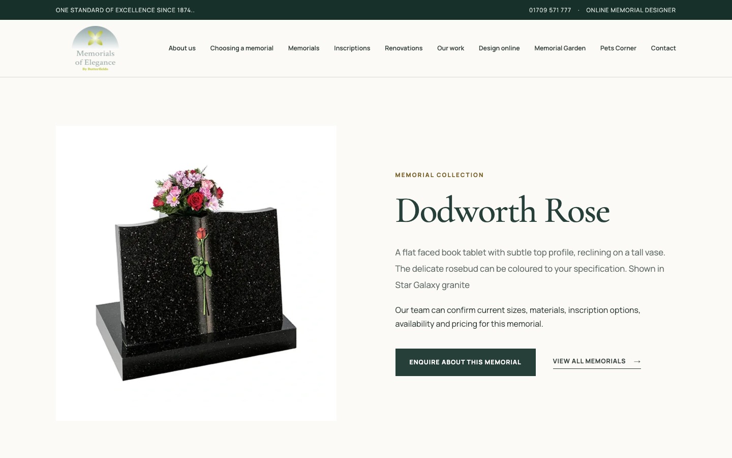
The old product page held plenty of information, but several elements competed for attention and the route into an enquiry felt separate from the item being viewed. A visitor could spend time finding a memorial, open the contact page and then have to explain which one they meant.
The new product layout gives the memorial image, name, short description and starting-price context a clear order. The main action is specific to the product. When a visitor chooses it, the contact form opens with that memorial already selected. The customer does less repetition and the business receives a better starting point for its reply.
This was an important principle across the project: if the website already knows something useful, it should carry that context forward instead of asking the customer to type it again.
6. One location, properly explained
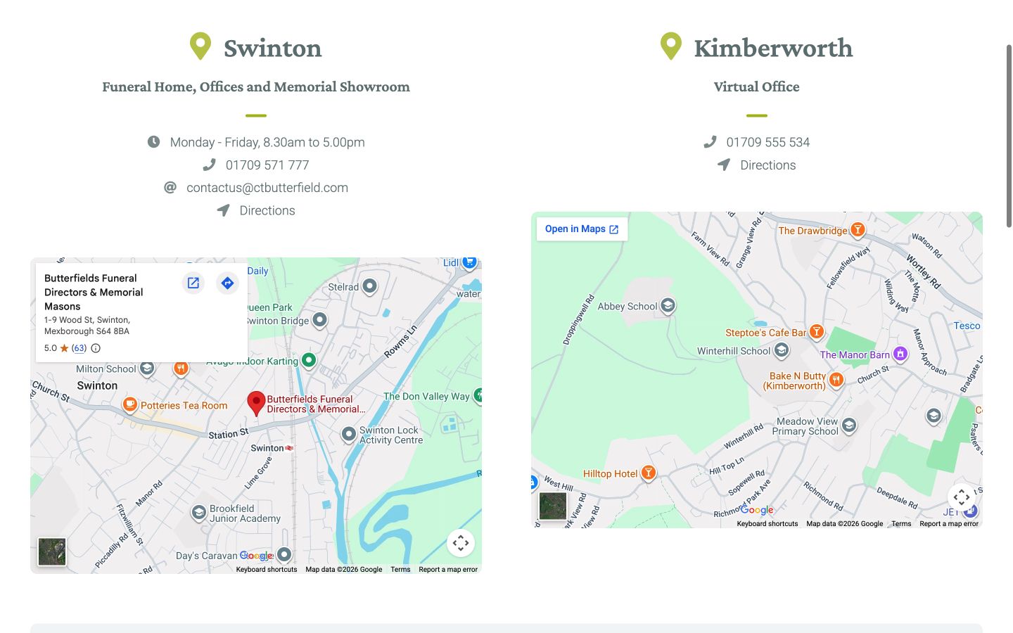
The old contact page split attention between the Swinton office and a virtual office map. The second location did not help someone planning a visit, and the two maps took up a large amount of space without giving either location a strong hierarchy.
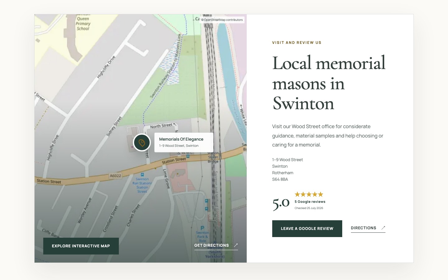
The replacement focuses on the real Swinton office. It combines the address, map pin, directions, opening information and a current Google review score in one module. A visitor can decide whether to visit, call or leave a review without comparing two competing panels.
7. A contact form that sets expectations
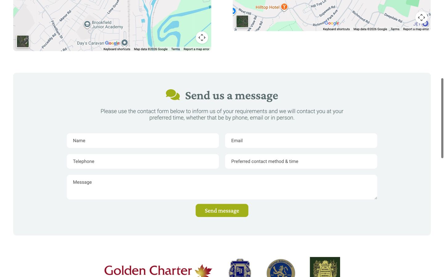
The old form relied heavily on placeholder text. Once someone began typing, the hint disappeared, making it harder to check what each field contained. Required and optional information was not easy to distinguish, and there was little explanation of what would happen after submission.
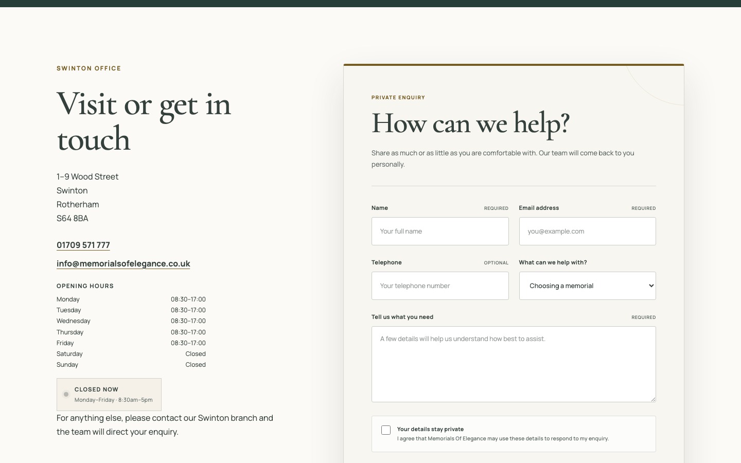
The new form keeps labels visible, marks required and optional fields, asks what the enquiry concerns and explains the privacy choice beside the form. It also says that the team usually replies within one working day and that there is no pressure or obligation. Those sentences are small, but they answer the questions many people have before pressing Send.
8. Finished work with a reason to be there
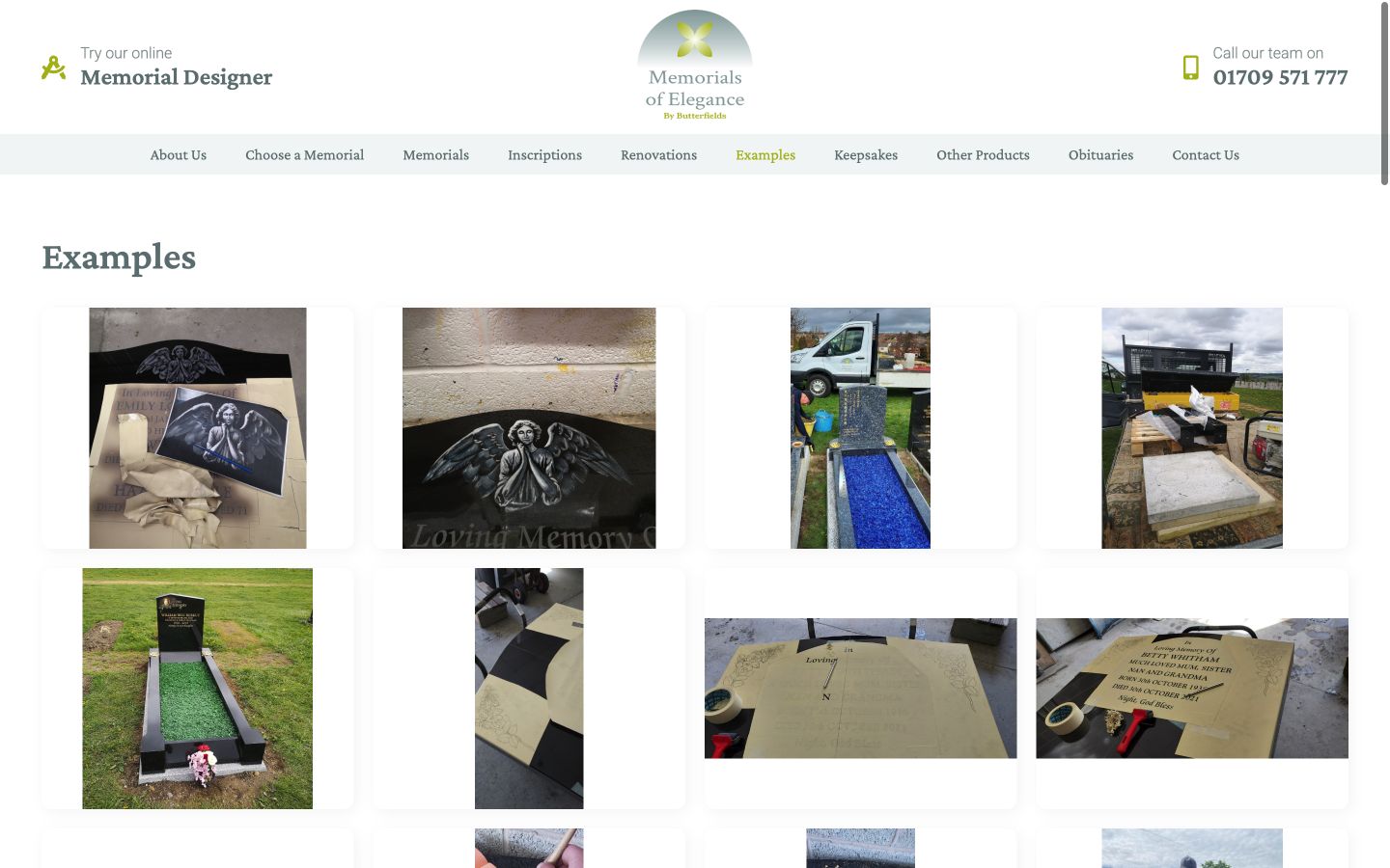
The old gallery mixed different crops, workshop photographs and repeated views with very little explanation. It proved that the business had completed work, but it asked visitors to work out why each image mattered.
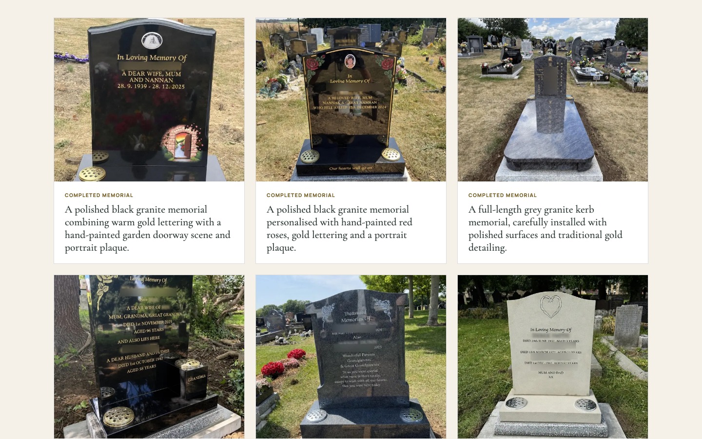
The new “Our work” page uses a consistent image treatment and gives every finished memorial a useful caption. The renovation section goes further. The Bolton Project explains the original problem, the safe removal, new foundations and secure refitting, then shows the work in sequence. The photographs now support a story about judgement and craftsmanship rather than acting as a loose image dump.
Two tools built for the real work
Some parts of this project could not be solved with better page layouts alone. Memorial design and renovation quoting both involve structured choices, so I built a dedicated tool for each task.
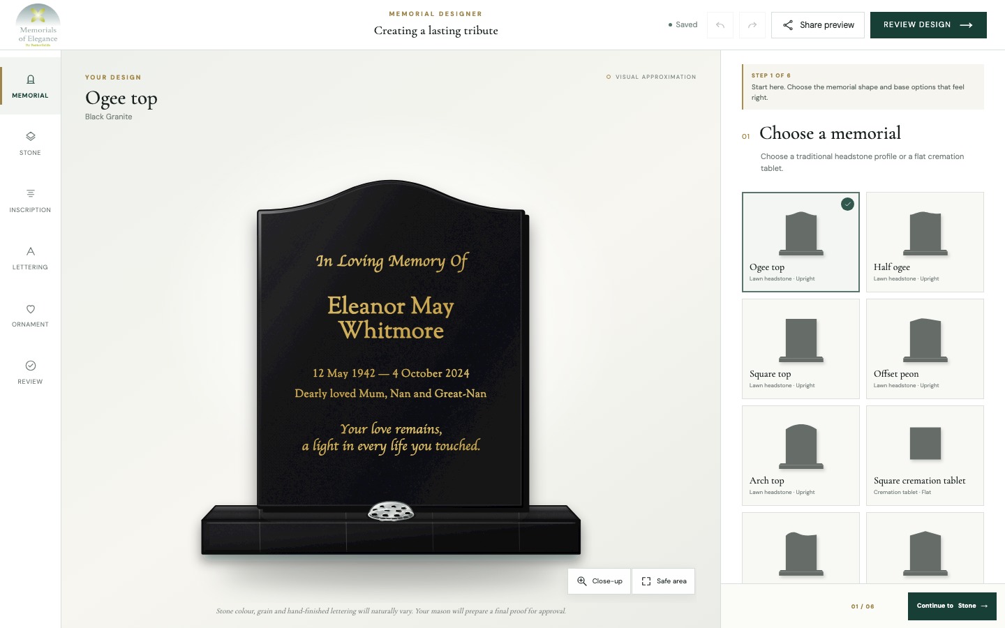
The six-step memorial designer
The designer lets a customer choose a memorial shape, stone, inscription, lettering and ornament before reviewing the result. The design updates on screen as choices change. It saves progress in the browser, offers undo and redo, and can create an image to share. Nothing is ordered or paid for online. The business still prepares the final proof and confirms what can be produced safely.
That boundary matters. The tool helps someone explore ideas and gives the mason a clearer brief, but it does not pretend that a sensitive, made-to-order product can be reduced to an instant checkout.
The five-step renovation quote
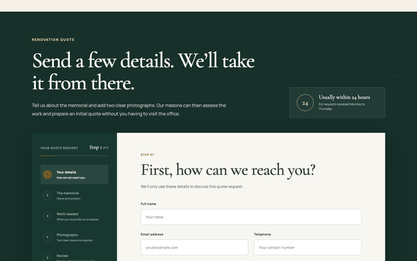
A renovation enquiry needs different information from a general message. The guided form asks how to contact the customer, where the memorial is located, what work may be needed and for two clear photographs. It tells people that “not sure” is an acceptable answer, because diagnosing the stone is the mason's job. The progress rail shows what remains, while the response panel sets a usual 24-hour expectation for weekday requests.
The result is a better request without making the customer feel responsible for technical decisions. The team receives the location and photographs it needs to assess the work, and the customer knows why each detail is being requested.
The CMS behind the website
The public pages are only half of the project. Memorials, materials, descriptions and supporting content all need to be maintained after launch. I built the CMS around those actual content types, so the business can update a memorial without treating every change as a free-form page edit.
That structure keeps the public experience consistent. Product cards draw from the same source as detail pages. Categories and filters use proper product information. The enquiry route can carry a memorial name because the site understands that a memorial is a record, not a sentence buried inside a block of text.
It also makes future work more manageable. New memorials can follow the same content model, while changes to shared presentation do not require the business to rebuild individual pages. The CMS was designed as part of the customer experience, not added at the end as an editing convenience.
Recovery and responsible details
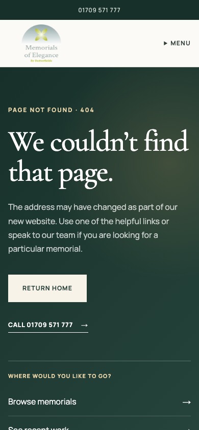
Good experience design includes the moments when something goes wrong. An invalid address on the old site displayed the surrounding website shell but no useful error message. A visitor could not tell whether the page was missing or still loading.
The new 404 page explains what happened and offers several sensible routes: return home, call, browse memorials, view recent work, read about renovations or contact the team. The same care appears elsewhere through a skip link, persistent form labels, keyboard-visible focus states, a published accessibility statement and a cookie panel that gives Accept, Reject and Manage choices equal prominence.
The outcome
Memorials of Elegance now has one joined-up platform instead of a collection of loosely connected pages. The homepage explains the service and the area it covers. Guidance supports people who are unsure. The catalogue gives confident visitors a fast route to a known product. Product enquiries retain their context. Renovation requests collect the right evidence. The designer helps families explore an idea without implying that the final memorial can be ordered with one click.
The visible change is substantial, but the main improvement is in the decisions the website helps people make. Every important page has a clearer purpose, stronger reading order and a useful next action. Mobile visitors receive the same information rather than a reduced version of the service.
I have not attached invented conversion percentages or performance claims to this project. The defensible result is the work itself: a live website, a structured 217-item catalogue, a custom CMS, a six-step memorial designer, a five-step renovation quote process and a more considerate route from research to conversation.
The old site helped establish the business online. The new one gives its knowledge, craftsmanship and customer care a structure that is easier to understand and easier to use.
Does your website need to do more than describe the business?
If customers need to choose, configure, book or send structured information, tell me how the process works now. I will help you work out what should stay simple and what needs to be built properly.
Tell me about the project